The Brief
Before getting into the design, I had a few requirements in mind.
I wanted a website that was fast, responsive and relatively simple to maintain. I wasn't building a web application or anything particularly complicated. It just needed to be somewhere I could present my projects, document experiments and share what I'd learnt.
I also wanted it to have some personality. Something suitably nerdy, perhaps with a few terminal-inspired elements, but without turning the whole thing into a gimmick. I still wanted people to find their way around without having to figure out some elaborate interface.
Another consideration was how to present projects. I didn't want every visitor to have to read pages of technical detail, but I also wanted the option to go deeper when there was something interesting to share.
That gave me a fairly straightforward starting point: keep the website lightweight and easy to navigate, but leave plenty of room for experimentation.
Choosing the Approach
I wasn't particularly attached to a specific web framework. I knew what I wanted the website to do, but I was happy to explore different ways of building it.
After discussing the requirements with ChatGPT, Astro was suggested as a good fit. A mostly static website made sense for something primarily focused on presenting information, and Astro offered a way to introduce interactive elements without needing to build a full web application.
That seemed like a sensible balance. I could have a relatively straightforward website underneath while still experimenting with the details that give WIP/LABS its character.
The other big decision was to use AI assistance throughout development. Rather than simply asking for an entire website and accepting whatever came back, I've been treating it as an iterative process: discussing ideas, reviewing what gets built, identifying what isn't quite right and working through improvements.
I didn't need to know exactly how every part would be implemented before starting. I could focus on the requirements and the experience I wanted, then evaluate the implementation as it developed.
Designing WIP/LABS
I had a rough idea of what I wanted WIP/LABS to look like, but getting there involved quite a bit of experimentation. Some ideas worked straight away, while others seemed great until I actually tried using them.
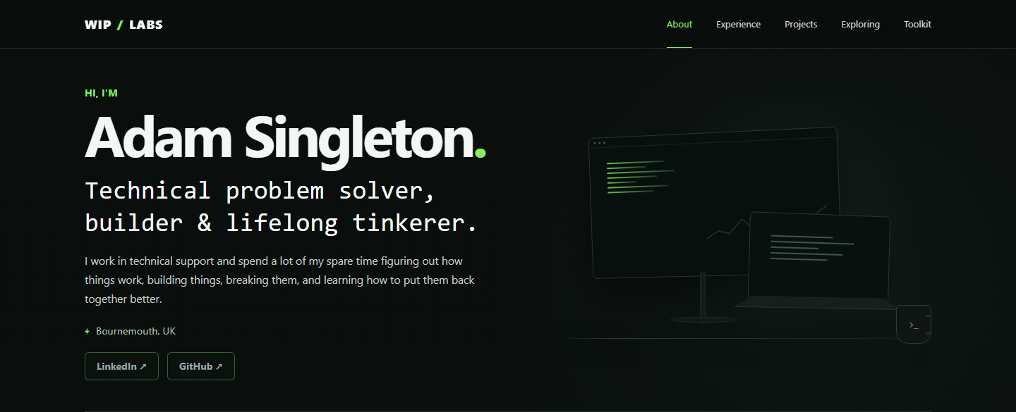
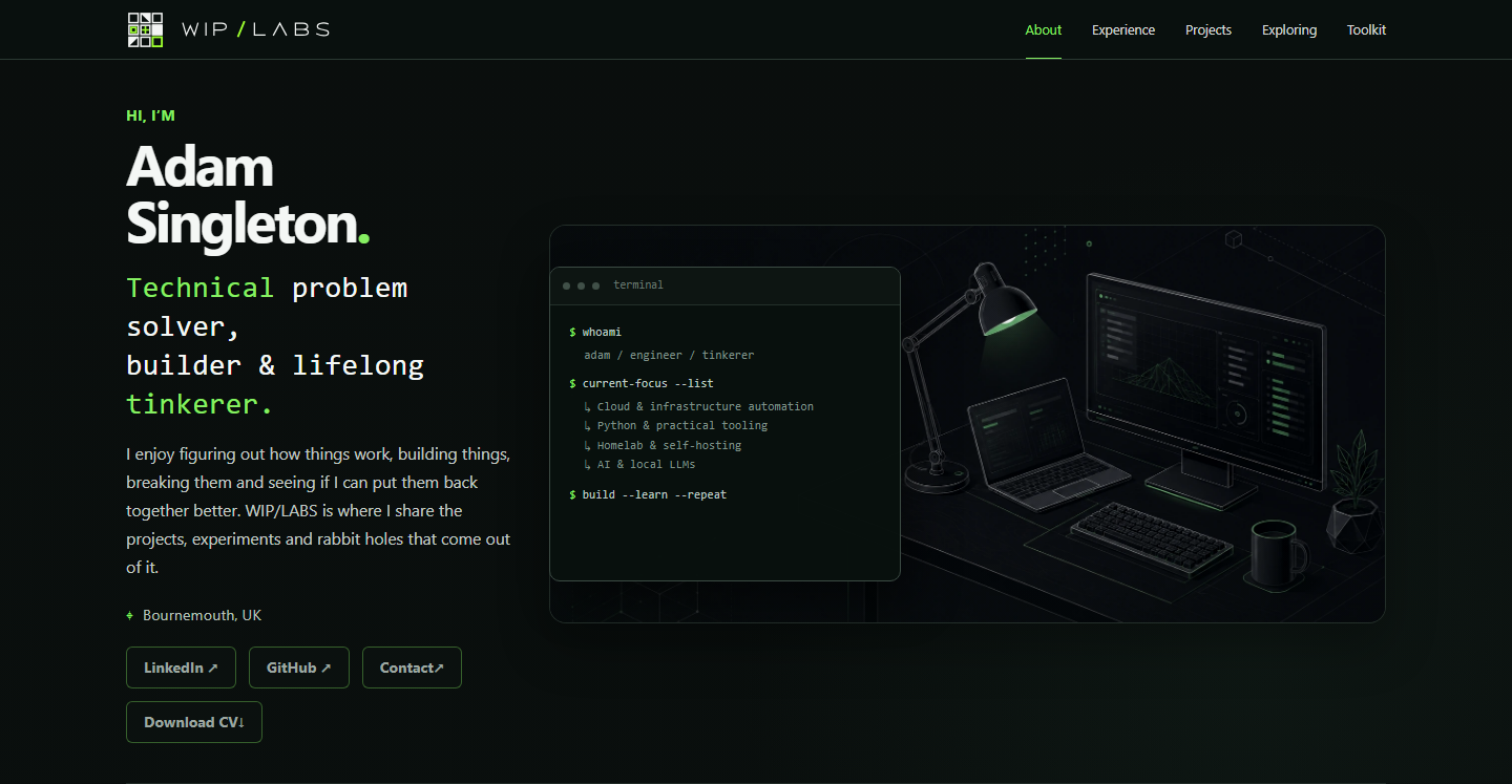
The homepage was one of the first things we worked on. An early implementation didn't quite match the mock-up, so we revisited the layout and introduced the illustrated workstation alongside the introduction. I liked the direction, but there were still things to tweak, including the size of the terminal, the typography and where the green accents appeared.
The homepage hero
 (full resolution, opens in a new tab)
 (full resolution, opens in a new tab)
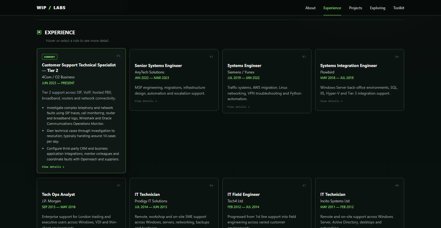
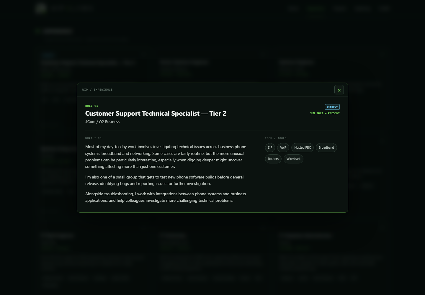
The Experience section went through a particularly interesting evolution. Initially, we tried having cards expand when you hovered over them. It sounded like a neat way to reveal more information, but in practice it made the page feel laggy.
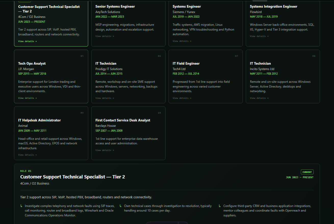
We then tried displaying the details below the card grid, which introduced another problem: you could click a card without necessarily seeing anything change because the updated information was further down the page. A sticky side panel came next, before we eventually settled on the click-to-open window used today.
How the Experience cards opened
 (full resolution, opens in a new tab)
 (full resolution, opens in a new tab)
 (full resolution, opens in a new tab)
The navigation had its own challenges. We originally had a header that changed size as you scrolled, but it didn't feel particularly smooth. Simplifying it to a consistently slim header worked better, although we still had to resolve issues with section highlighting and the mobile menu.
The branding evolved too. I liked the idea of a modular, puzzle-like logo, and we experimented with different arrangements, lettering and colours before settling on the current design. Seeing the logo in the context of the website made a big difference to deciding what worked.
The navbar logo
 (full resolution, opens in a new tab)
 (full resolution, opens in a new tab)
Another important decision was how to present projects. Rather than forcing visitors to choose between a short card and a full technical write-up, I wanted something in between. That's how we arrived at the expandable project overviews, with dedicated pages for anyone who wants to explore further.
Looking back, I think one of the biggest lessons has been that an idea working in theory doesn't necessarily mean it works well in practice. Being able to experiment, test things and change direction without starting from scratch has been one of the most useful parts of building WIP/LABS.
What's Next?
Getting WIP/LABS online is only the beginning. There's still plenty I want to add, experiment with and improve as the site evolves.
I'd like to keep developing the individual project pages, documenting not just the finished results but also the decisions, unexpected problems and lessons along the way.
Building the site with AI has been an interesting learning experience in itself. It's taught me a lot about communicating ideas clearly, reviewing what's been produced and refining things until they feel right.
I don't really see WIP/LABS as something I'll ever completely finish. As long as I'm building things, experimenting and disappearing down technical rabbit holes, there should always be something new to add.